Graph 1 shows Rox 2010 winning percentage versus historical (1993 - 2009) winning percentage and pythagorean winning percentage through the different months of the season. What a great start, too bad the rest of the year was average!
 Graph 2 shows projected wins versus previous years (2007 - 2009). It was so hopeful midway through the year - then the post All Star hangover, then a late in year surge followed by the awful collapse.
 Graph 3 shows the average runs scored per game both home and away. Who loves the humidor? What is with scoring on the road?
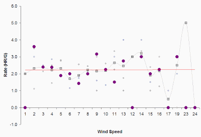
 Wimisical data for the next three graphs. Home run rates for temperature, wind speed, and wind direction (2007 - 2010, purple points indicate 2010 grey squares is average). Interesting how wind speed doesn't do much for home run rates.


No comments:
Post a Comment